Essays
Paper Trails: Victoria Reichelt & Carly Fischer, Dianne Tanzer Gallery + Projects / This is No Fantasy, 2014
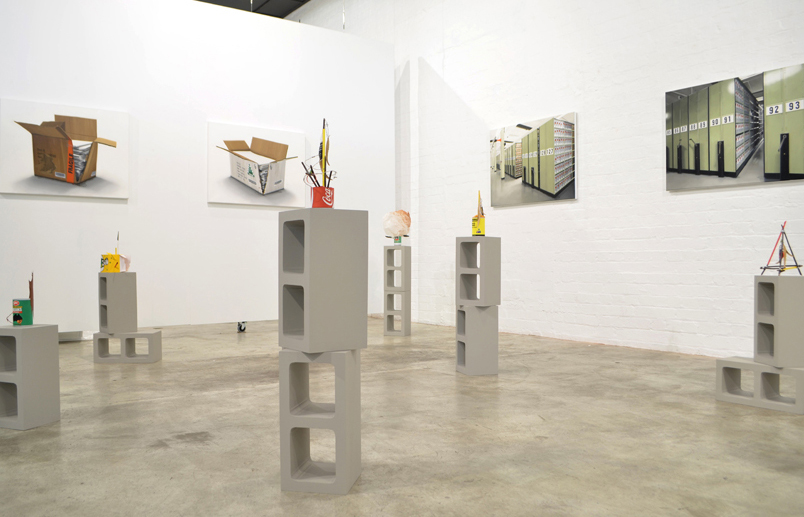
The exhibition Paper Trails reflects on a dialogue between the work of artists Victoria Reichelt and Carly Fischer. Developed as separate works, Reichelt’s paintings and Fischer’s sculptures share the exhibition space at Dianne Tanzer Gallery/Helen Gory Galerie to explore a common vocabulary. They begin the conversation with a shared interest in the peripheries; the discarded objects that accumulate in forgotten places, gathering dust. In Reichelt’s paintings it is the boxes of paper archives that gather dust inside archive storerooms, while Fischer’s sculptures reference the kind of detritus dropped in the desert, sprayed with red dirt. Zooming in on these fragments, both artists re-present the peripheral as a kind of Paper Trail that leads to the broader cultural concerns of their contemporary context. Reichelt and Fischer both reflect on the precarious medium of paper by creating propositional monuments that seem to mirror each other inversely in the space. While Reichelt concretises passing paper archives in paint, Fischer fabricates transient desert trash as scale paper models. No longer the original fragments but generic replacements, both Reichelt’s paintings and Fischer’s sculptures are like replicas of precious cultural artifacts to be placed in a museum. They have been elevated from margin to centre along a Paper Trail as perfect but precarious propositions, with their traces erased behind them.
Fischer’s sculptural series Total Eclipse of the Heart references the potent yet peripheral place of The Central Australian Desert through its detritus. Reflecting on the complex relationship between its stereotypical representation and some of the harsher realities experienced through journeying there, Fischer suggests a place littered with complexities and contradictions. As an artist-in-resident, tourist and pseudo-ethnographer, Fischer explores The Central Australian Desert from postcard to place, intertwining magical preconceptions of hauntingly empty landscapes and ancient spirits with the more mundane trash accumulating in a contemporary context. Ripped beer cans, dusty plastic bags, fast food containers, bottle caps, straws, red rocks, dead leaves, grass, barbed wire, kangaroo road signs, kitschy tourist souvenirs and desert art and craft are remixed and represented as hybrid 1:1 scale paper models. Shape-shifting between ethnographic artifacts, souvenirs, desert art and craft and roadside trash, they are propositions from a place that is somewhat unsure. As carefully crafted fabrications, the sculptures reflect on the perfect yet precarious construction of The Central Australian Desert at the heart of Australian national mythology. Placed atop fabricated Besser Blocks as makeshift pedestals, they are provisional rather than permanent. Between representation and reality, magic and mundane, trash and the treasure, they each suggest a contradictory moment as a monument, a Total Eclipse of the Heart.
In the past Reichelt’s work has focused on the shifting fortunes of books, magazines and printed matter. She is now extending her focus to consider broader library and archive spaces, and the uncertain future that they currently face. Her works in Paper Trails document the quiet unrest and potential redundancy of traditional archive methods and spaces. Similar to her earlier works that positioned animals in libraries, these new works suggest a changing landscape as people increasingly move away from physical and towards digital environments. As spaces that accumulate traditional paper information are becoming outmoded, their susceptibility to physical damage (as opposed to digital archives) is becoming more apparent. Here, archive spaces and archived documents show the early signs of encroaching water damage. Darkened cardboard at the base of boxes hint at the doomed soggy mess within. A small puddle creeps ominously from underneath a shelf. As water sneaks in to threaten these objects and spaces, these works invite the viewer to consider what we would lose with their absence and the implications of the digital’s transcendence over the physical.
___________________________________________________________________________________
Art Stage Singapore, Louise Martin-Chew 2013
")
The relationship between humans and animals is complex. The sharing of genes and thousands of years of history has, at its heart, an appreciation of difference. Animals may be food source, friends and companions, or a threat. However, we believe in our status as a more evolved species. We don’t hesitate to dominate and control them because they exist without rational thought and are therefore lesser. In contrast to humans, animals do not use language to explain things to each other – at least not a language to which we may subscribe. Our belief in language, our reverence for written expression, is paramount.
In her recent work for Art Stage Singapore, Victoria Reichelt speaks to the imaginative possibilities in the collapse of that distinction. She places wild animals in the language-rich and written word-driven archive, within the library as the repository of human knowledge. In so doing she acknowledges the endangered status of both as a result of technological and environmental advances, and points up the significant gaps in our rationalist view of the world.
These painstakingly painted realist interiors show crammed library shelves pushed close to the frame, airless in their proximity to the viewer in a way that evokes the stale and musty air of the traditional library environment – hermetically sealed against the outdoors. Yet within this unnatural environment wild animals are depicted – a turtle craning its neck curiously upward is a surreal and foreign element in Slide (2012), Hang sees a snake entwined on a table leg under a desk bearing the already redundant microfische, in Glide a snail traverses the spine of one book on a crowded trolley.
These animals, themselves endangered, interact with their foreign surrounds with curiosity and discomfort – their knowledge repositories vastly different to ours. In an interior that points toward the ceiling, a square light is marked LIBRARY CLOSING – a reference to the redundancy of the book and the endangered status of the library as technology moves toward electronic storage.
This work is part of a broader investigation on the part of Reichelt into objects that are in danger of becoming obsolete or redundant. She suggested, “In these works the animals wander through stacks and shelves as they would a forest … never looking very comfortable. The animals hint at the alien way, we too, may feel about rooms full of books in years to come.”
Yet these works also evoke the contrast in instinctive understanding of nature and place so developed in animals, the romanticism or fear with which we regard the wild and plumbs the constraints of human knowledge. The use of verbs for the titles of each work also speaks to the animalistic instinct for action over thought.
They also dally with the history of painting, the tensions that exist between the creation of a tactile realist surface and its shared fragility in the face of new technologies. They draw us in, by their skill, the vortex-like compulsion they create for our eye, and the strange surreal nature of their narrative. Victoria Reichelt stalks her medium with precision.
___________________________________________________________________________________
Catalogue, Exhibition catalogue, by Simon Gregg 2012
")
The expression ‘A Painter’s Painter’ has become commonplace today, without anybody really knowing what it means. But if anybody deserves such a perplexing moniker it is surely Victoria Reichelt, whose practice persistently and succinctly explores the problems of painting in the early twenty-first century, in paintings that are themselves magnificent exemplars of the medium.
The greatest challenge posed to painting in the last 200 years has been the camera. So when Victoria Reichelt set out to produce stunningly realised photorealistic paintings, it seems almost natural that she should chose the camera as her subject. As with all of Reichelt’s work, there was a not-so-hidden double entendre; the camera itself became the means by which she challenged the camera’s authority as image-maker. Gradually however, the camera paintings have given way to paintings of book and magazine spines, grouped together by colour. These works have helped establish Reichelt as one of Australia’s most distinctive realist artists.
Reichelt’s paintings of cameras and, later, books and magazines, show how she continues to think through the problems of painting without ever making her work uninteresting for non-painters. Her work appeals on many levels; she allows viewers to connect with the subjects, and to embrace her playfulness in renegotiating the rules around painting. Of greater import; Reichelt confirms that the questions explored through figurative painting are as critical as those faced by non-figurative artists. That she succeeds in exploring difficult questions about the ongoing validity of painting in paintings that are immediately accessible is perhaps the greatest of her accomplishments.
CATALOGUE represents, as one would expect, a brief catalogue of Reichelt’s output from the last three years. Present are Blue Ocean and Purple Haze from her 2009 game-changing exhibition Spectrum, two paintings of magazine stacks, four Life magazine covers, and a major new work, Colour Field, which depicts the view down the aisle of a library, with books massed on shelves on either side.
The Spectrum paintings, which originally numbered eight, reference Piet Mondrian’s abstract paintings from the 1920s, in which blocks of colour were divided by black lines. They themselves referenced the street grid, but by intending to liberate colour and line from description they were hailed as a major breakthrough for abstraction, and a decisive nail in the coffin of figurative art. Nearly a century later, Reichelt returns to Mondrian’s grid, but as the means of providing structure to her figurative art. The Spectrum series retained the appearance of minimalist abstraction from a distance, but up close the details of the book spines became apparent. In so doing Reichelt ingeniously demonstrates that abstract art can be literal too.
The grouping by colour is important, whether the subject be books or magazines. Reichelt reaffirms the ascendency of form over content; order is guided by colour rather than text. The text loses its function, and the books are made to serve as props for the two- dimensional image. Reichelt writes of these works:
“The books are disparate groups connected only by their spine colours – using them in this way echoes Minimalist concerns of form over content, whereby the books are stripped of their literary significance and reduced simply to colours. In these works, the books highlight the repetition of geometric forms through a colour spectrum, thus the titles and what they represent are no longer the focus, rather they act as structural tools in a bigger picture”.
Colour Field (2012) is a culmination of Reichelt’s concerns. Taking place in a library, it introduces depth and perspective to the Mondrian grid, proposing that colour field abstraction can be experienced in three dimensions. By extension we may detect Reichelt’s endless sifting and sorting of the world by colour applied to everything around us. Wherever we look we see objects aligning by colour, producing a kind of newfound chromo-cosmology. The overall effect of Reichelt’s work is to not merely reaffirm the ongoing validity of figurative realist painting, but the power of colour to guide our daily encounter with the world.
Click here to see the catalogue
___________________________________________________________________________________
Paint is the answer but what is the question?, Korea International Art Fair, Kate Rhodes 2011
")
")
My husband used to carry a tiny piece of paper in his wallet with the issues of Art + Text he was missing written on it. At secondhand bookstores it would be pulled out and checked against each spine in the magazine section. Eventually the numbers were crossed off and now only issue 1 is missing; forever a gap at the beginning of the horizontal run of colourful book vertebrae that change in height and graphics over the life of the publication, now out of print. Magazines hold a different kind of affection for us than books. A magazine is more easily lent out from a personal library but a gap created in the neat, numbered row by an unreturned copy holds a particular pain and finding back issues of a rare magazine grows the dogged sleuth in us.
Victoria Reichelt is only a modest consumer of magazines. For SHIFT, a series of paintings of stacked magazines, she called friends and even publishers for their contributions. Reichelt first photographs the magazines she paints with a bright studio light beamed across from one side. Looking at the finished works with this knowledge, the wobbly piles seem to anthropomorphize into poses – particularly as they are scaled at ‘lifesize’. In Reichelt’s detailed strokes of oil paint, glossy ‘portraits’ on stark white backgrounds become the most apt way to capture these paper towers, as if they were themselves looking in the mirror. The flat grey shadows created by the light reiterates the feeling that the tables have turned, and the magazines are being given the same treatment they impose on their fashion model subjects.
Monthly fashion magazines such as Vogue and Harper’s Bazaar figure heavily in SHIFT and the piles of dated spines highlight their short cycle of usefulness. They represent only a capsule of authority; July is influential, while only-just-outdated June is jettisoned. As fashion historian James Laver discussed in his famous timeline of acceptability in dress, any fashion which is considered to be beautiful now will only be widely deemed as beautiful again 150 years after its first appearance. In between now and then, it will be judged as dowdy, hideous, ridiculous, amusing, quaint, charming and then romantic before the cycle is complete, in that specific order.[1] Laver’s timeline has been reduced to something more like twenty years but still the fashion magazine fares much like the fashion itself on sale inside the covers. It must wait before regaining credibility, or at least quaint respect, once again.
Before SHIFT, Reichelt painted the book collections of fellow artists, making a kind of metaphoric portrait of each via their favourite reads. The approach recalls François Truffaut’s film Fahrenheit 451 and the ‘book people’, where individuals eventually ‘become’ a book by way of knowing its contents so thoroughly. However, in this exhibition, the magazine is just a thing consumed and then discarded with no particular motivation or consistency. If SHIFT were a portrait of a single magazine collector, then the mish mash of titles and dates, double-ups and gaps reveals an uncommitted reader – not a subscriber, but a grazer on magazine content. This imaginary owner seems disinterested in gnawing on the slow build a magazine can offer as a string of issues that grow into a bigger meal.
Indeed, to hold a magazine in the hand is to grasp a representative of the labour of the scores of people – writers, designers, sub-editors, proof-readers, sales, paper and production people, publishers, printers and distributors. They typically represent thousands of hours of individuals’ work all bundled and bound up together. And then there are the advertisements that financially underpin the whole enterprise, backed by their expensive campaigns and teams of independent art directors, photographers and models. This work is threaded through the careful eye of an editor who curates the content so that the magazine literally has a personality that goes with its name.
Reichelt calls the series of works in SHIFT ‘loving portraits’, an ode to the potentially unhappy future the hardcopy magazine faces; now more or less in a state of analogue-digital flux. It’s the shift in SHIFT. Thus, each portrait might even symbolize a kind of memorial cairn – a stack of magazines rather than stones – that marks the death of a format in the face of a growing online readership. The artist also laments the loss of the magazine stack as a piece of domestic decor. Again, the ‘objectness’ of the magazine in her work turns them in a real subject for contemplation while paint signifies a lost ‘flickability’ to the Kindle and iPad. But arguably the magazine is not a near-historical artifact looking at the same looming trajectory as the book. Its mobility, affordability and zeitgeist-y persona is its own elixir. Indeed as Dieter Roelstraete wrote in Frieze earlier this year,
While artists seem to be consuming as well as producing more books than ever before, more art magazines are being published today than at any time in recent history and the seemingly limitless demand for content to fill the cosmic expanse of Cyberia has meant that there has never been so much writing about writing, publishing about publishing, talking about talking or language about language.[2]
The magazine is a source of quick turn around criticism and dialogue. They tend to have communities of followers, both subscribers and regular buyer-flickers, while books have multiple individual champions along a very different time scale. We love books but we love loving magazines. Magazines have blogs, talks programs, events, associated educational activities, curated exhibitions, online TV stations, commissions, e-newsletters, some even have their own art fairs and stores. Today, many magazines are powerful nodes for a sea of additional communication outlets branded with the publication’s masthead. As magazines of all stripes inhaled at the end of 2008 and into 2009, shrunken by GFC-induced low ad sales, publishers soon realized that one strain of income was too risky. Now many of the most well-known art, fashion and culture magazines are just the two-dimensional face of multi-tasking companies that are acting more like cultural institutions.
SHIFT reflects a consistent thread in Reichelt’s practice as other bodies of work have explored collections and technologies on the brink of profound change. Collections encourage observations, comparisons; a fact heightened this artist’s impeccable brush strokes that give an eye-field of detail. Ironically, perhaps, painting itself is an activity that we constantly hear is in the throes of an immanent death. If paint is the answer, the question must be: how do you make a portrait for sustained looking of a long-lived and well-loved technology, not fading but morphing?
Kate Rhodes is curator of the RMIT Design Hub and creative director of the 2011 State of Design Festival. She is a former editor of Artichoke magazine.
[1] James Laver and Amy de la Haye, Costume and Fashion: A Concise History (London and New York: Thames and Hudson, 2002 [1969]) 28.
[2] http://www.frieze.com/issue/article/word-play/ accessed 1 June 2011.
___________________________________________________________________________________
회화(Paint)가 바로 해답입니다. 그렇다면 질문은 무엇일까요?
Korea International Art Fair, Kate Rhodes 2011
제 남편은 오랫동안 작은 쪽지를 지갑에 넣어 가지고 다녔습니다. 거기에는 Art + Text라는 잡지 중 남편이 소장하고 있지 않은 발행 본들의 목록이 적혀 있었습니다. 헌책방의 잡지 코너에 가면 혹시라도 자신이 찾고 있는 잡지가 있지 않을까 하고 지갑에서 쪽지를 꺼내 대조해 보곤 했습니다. 결국 그 쪽지에 적혀 있던 발행 본들의 목록이 하나씩 지워져 가고 이제는 그 잡지의 창간호만 남았습니다; 파란만장한 출판의 역사를 통해 잡지의 크기나 그래픽들이 알아보기 힘들 정도로 많은 변모를 겪었고 이제는 절판이 되었다는 그 창간호는 아직도 끊임없이 찾아 다니는 하나의 잊혀진 보물이 되어 버렸습니다. 책보다도 잡지는 특별한 애착으로 다가옵니다. 책보다 쉽게 빌려줄 수 있지만, 다시 돌려 받지 못했을 때는, 잡지들이 발행 순서대로 차곡차곡 정렬되어있는 그 책장에 채워지지 않은 영원한 아쉬움으로 남게 됩니다. 희귀한 잡지의 지난호를 찾아 다니는 것은 하나의 끈질긴 추적과도 같습니다.
빅토리아 라이켈트(Victoria Reichelt)는 보통의 잡지 소비자 입니다. 그러나, 차곡차곡 쌓여진 잡지들에 대한 일련의 회화 작품인 SHIFT를 위해서 친구들은 물론 심지어는 출판사에까지 부탁해서 열심히 잡지들을 모았습니다. 라이켈트는 우선 한쪽 방향에서 쏟아지는 밝은 스튜디오 조명을 이용해서 자신이 직접 그린 잡지들에 대한 사진을 찍었습니다. 이러한 사실을 알고 완성된 작품을 보면, 넘어질 것처럼 쌓여 있는 이 잡지들은 마치 의인화된 것처럼 여러 가지 포즈로 탈바꿈되는 것을 볼 수 있습니다 – 특히 ‘실제 크기로’ 그려졌기 때문에 더더욱 그러합니다. 라이켈트의 세밀한 오일 페인팅 기법과 하얀색 바탕에 대조적으로 광택이 나는 ‘초상화(Portraits)’ 기법은 마치 거울을 바라보는 효과를 내어 이런 종이 탑을 표현하는데 가장 적절한 표현방법이 되었습니다. 빛에 의해 만들어진 단조로운 회색 그림자는 상황이 바뀌었으며, 잡지들도 패션 모델들이 받는 대우를 받을 수 있다는 것을 보여줍니다.
보그 (Vogue)나 하퍼즈 바자 (Harper’s Bazaar) 같은 월간 패션 잡지들은 SHIFT에서 비중이 크지만, 또한 날짜가 지난 이러한 헌 잡지들이 수북이 쌓여있는 것을 보면 이런 류의 잡지들의 반짝 인기도 알 수 있습니다. 이 잡지들은 일시적인 권위만을 보여줍니다; 7월호는 다들 찾는 인기 잡지지만, 그 전달 6월호 잡지는 이제 완전한 폐품입니다. 패션 역사학자인 제임스 라바 (James Laver)는 그의 유명한 의복에 대한 대중적 수용성(Acceptability)에 대한 주기를 설명하면서, 현재 아름답다고 여겨지는 패션은 150년이 지난 이후에야 다시 유행할 것이라고 예견했습니다. 하지만, 그 사이에는 촌스럽고, 끔찍하며, 우스꽝스럽고, 재미있고, 특이하고, 매력적이며 마지막으로 낭만적인 것으로 취급되는 일련의 ‘주기’를 겪으며 하나의 패션 유행이 마감된다고 말했습니다.[1] 라바의 주기는 이제 20년 정도로 줄어 들었지만, 패션 잡지 역시 패션과 마찬가지 운명을 겪고 있습니다. 신용을 얻거나 적어도 개성적이라는 평가를 받기 전까지는 상당한 시간을 두고 기다려야 하는 것입니다.
라이켈트는 SHIFT 작품 이전에는 동료 예술가들의 장서들을 주로 화폭에 담았습니다. 동료 예술가들의 애독서를 그림에 담아 냄으로써, 그들의 은유적인 초상화를 만들었습니다. 이러한 접근 방법은 프랑스와 트뤼포 (François Truffaut)의 영화 화씨 451 (Fahrenheit 451)와 북 피플 (book people)을 연상시킵니다. 이 영화에서는 개개인들이 하나의 책의 내용을 철저하게 파악함에 따라 실상 그 책이 ‘되어’ 버립니다. 하지만, 이 전시회에서의 잡지는 특정한 동기나 일관성이 없이 소비되고 폐기되는 하나의 사물일 뿐입니다. SHIFT가 한 잡지 수집가의 초상화라면, 각종 잡지 제목과 날짜, 중복되고 비어 있는 모습들은 정처 없이 떠다니는 익명의 독자들을 상징합니다 – 구독자가 아닌 잡지 목차만을 훑어 보는 그런 구경꾼말입니다. 이러한 허구적인 잡지 독자들은 점차 푸짐한 정찬으로 알차게 커져가는 잡지들이 매 발행 본마다 던져 주는 식사를 차곡차곡 소화해 나가는데는 관심이 없는 것처럼 보입니다.
실제로, 하나의 잡지를 보면, 거기에는 작가, 디자이너, 편집 기자들, 교정자들, 영업부원, 제작부원, 발행인, 인쇄부원 및 공급처에 이르기까지 수많은 사람들의 땀과 노력의 결실이 담겨 있습니다. 따라서 잡지들은 그러한 개인들이 쏟는 수천시간에 달하는 집중된 작업을 대표한다고 할 수 있습니다. 또한 이 잡지업계를 경제적으로 지원하고 있는 광고업계도 있습니다. 잡지는 광범위한 홍보 캠페인과 아트 디렉터, 사진사 및 모델로 이루어진 팀에 의해 광고됩니다. 이러한 작업은 잡지의 내용을 엮는 편집자의 꼼꼼한 눈을 통해 꾸며지기 때문에 실제로 잡지는 그 잡지의 이름에 어울리는 일종의 ‘성격(Personality)’을 가진다고 할 수 있습니다.
라이켈트는 SHIFT에 담긴 일련의 작품들에게 ‘사랑하는 초상화(Loving Portraits)’라고 명명했는데, 이것은 종이에 출판되는 하드카피의 잡지들에게 다가올 불행한 미래, 아날로그-디지털 변화의 흐름속에서, 그들에게 닥칠 운명에 대한 서정시와도 같습니다. 이것이 바로 SHIFT라는 제목이 뜻하는 변화를 의미합니다. 각각의 초상화는 일종의 기념비를 상징한다고 할 수 있습니다 – 점차 커져가는 온라인 독자층에 비해 죽어 가고 있는 독차층 말입니다. 예술가는 또한 차곡차곡 쌓인 잡지들이 일반 가정의 실내 장식의 하나로서 그 자리를 잃어 가는 것에 대해서도 실망을 감추지 않습니다. 또한 잡지의 ‘객체화(Objectness)’로 인해 잡지가 실제적인 명상의 객체가 되기는 하지만, 킨들 (Kindle)이나 아이패드 (iPad)의 ‘페이지를 넘길 수’ 없는 기계성도 상징적으로 보여 줍니다. 하지만, 책과 같은 서글픈 역사적 운명을 잡지가 똑같이 겪고 있다고는 볼 수 없습니다. 이동성, 경제성 그리고 시기적절성을 가진 잡지는 바로 그 자체가 만병통치약과도 같은 효능을 발휘하기 때문입니다. 실제로 디어터 로웰스트레이트 (Dieter Roelstraete)는 올해 초 프리즈 (Frieze)에서 다음과 같이 밝혔습니다,
예술가들이 어느 때보다 많은 책들을 소비하고 생산하는 반면, 역사적으로 어느 때보다 더 많은 예술 잡지들이 오늘날 발행되고 있고, Cyberia (사이베리아)의 우주적인 팽창을 채우기 위한 콘텐츠에 대한 무한정한 수요로 인해 글쓰기에 대한 글쓰기, 출판에 대한 출판, 말하기에 대한 말하기나 언어에 대한 언어가 그야말로 넘쳐 흐르는 지경입니다.[2]
잡지는 급속한 생산이 가능한 비평과 대화의 근원입니다. 구독자이거나 정기적인 구매자, 비정기적인 구경꾼으로 이루어진 추종자들의 무리들이 잡지를 이루는가 하면, 책은 전혀 다른 시간 개념을 가진 복합적인 개별 챔피언들을 가지고 있습니다. 책을 사랑하지만, 잡지에 대한 애정도 사랑합니다. 잡지에는 블로그, 토크쇼 프로그램, 사건, 교육적인 활동, 전시회, 온라인 TV 채널, 커미션 작품들, e-소식지, 자체적인 아트 페어와 스토어도 있습니다. 오늘날, 많은 잡지들은 출판계를 이끌어 나가는 추가적인 커뮤니케이션의 한 출구로서의 강력한 지위를 차지하고 있습니다. 2008년 말과 2009년 사이에 모든 종류의 잡지들이 GFC (세계 금융위기)로 인한 광고 수익률 저조로 인해 타격을 겪음에 따라, 출판회사들은 한 종류의 수입원에 의존하는 것이 위험하다는 것을 절감했습니다. 현재 많은 유명 예술, 패션 문화 잡지들은 일종의 문화 단체와 마찬가지로 다양한 복합 과제를 진행하고 있습니다.
SHIFT는 라이켈트의 다른 작품들이 보여준 심오한 변화의 물결속에서의 기술 및 작품의 상태들을 탐색하는 자세와 일맥상통합니다. 이 작품들은 관찰과 대조를 부각시키며, 특히 예술가의 놀랄만큼 섬세한 브러쉬의 생생함으로 확연히 드러납니다. 아이러니하게도, 회화 활동 자체도 임종 직전의 고통을 겪고 있는 활동이라고들 합니다. 만약 회화가 해답이라면, 그에 대한 질문은 바로 다음과 같을 것입니다: 오랫동안 지속해 왔고 너무나 사랑받아온 기술 -사라지지는 않되 단지 변모하고 있는- 의 지속적인 모습에 대한 초상화를 어떻게 그려 볼 것인가?
Kate Rhodes씨는 RMIT 디자인 허브의 큐레이터이자 2011 State of Design Festival의 크리에이티브 디렉터입니다. 또한 Artichoke 잡지의 편집장도 역임했습니다
[1] James Laver and Amy de la Haye, Costume and Fashion: A Concise History (London and New York: Thames and Hudson, 2002 [1969]) 28.New York: Thames and Hudson, 2002 [1969]) 28.
[2] http://www.frieze.com/issue/article/word-play/ (2011년 6월 1일자).
___________________________________________________________________________________
Spectrum, by Emily Cormack 2009

Victoria Reichelt makes an interesting proposition in this new series of works. Here she proposes that the collision of signifiers that occur in her methodically colour-coded bookshelves is not an emptying of content as Baudrillard might suppose, but is instead an attempt to transcend signification, freeing colour to be colour and form to be form.
Reichelt proposes that these books, the life’s work and obsessions of a vast array of authors, have in fact been positioned within such an altered context that they are able to operate within another semiotic order altogether. They are no longer intended for reading and learning, but are instead beautifully executed aesthetic tools, embedded within the grid formations of some of Piet Mondrian’s most well known neo-plastic compositions.
This kind of semiotic shift exists across many levels in Reichelt’s practice. The very act of faithfully replicating something through realist painting techniques is in fact a semiotic sleight of hand. Whilst apparently exactly and accurately representing an object, a realist painting will never fulfil the original connotated function of its signifier or subject. It is always left hanging; the subject rebounds from meaning-making, back into the realm of representation, short-circuited by its reference to surface.
In Reichelt’s previous works this operation freed up the meanings of the book titles, allowing them to be assigned new signification as portraits of her subjects. These painted titles reflected the nuances, inclinations, and desires of her ‘sitters’, rather than the specific intentions of the authors. However in Spectrum, Reichelt encourages the painted spines to operate within their own paradigm: that of paint, and surface, colour and line. The stark thin lines of the title Kate become graphic and compositional, balancing the curving cartoon font of Alfred Hitchcock that sits three spines away, and leading the eye up and back to the hand written Stephen Fry that rests horizontally on top.
Piet Mondrian moved through early twentieth century developments in painting with a concise eye for trends and techniques, evidenced in his working with representational painting, impressionism, pointillism, and even cubism. Eventually with guidance from his religious and philosophical beliefs, Mondrian sought to attain a oneness with the spirit that transcended the coarse baseness of human form and our natural world. Mondrian felt he had attained this in his paintings when he did away completely with any signifiers of nature, eliminating green from his distilled palette, and working exclusively with primary colours, arranging blocks of colour so that they vibrated according to their own distinct material quality, with no reference to anything outside of their immediate appearance. His paintings were exercises in pure compositional unity and beauty.
In 1914, one year after abandoning representational painting, Mondrian explained this process in a letter to a friend H.P. Bremmer:
“I believe it is possible that, through horizontal and vertical lines constructed with awareness, but not with calculation, led by high intuition, and brought to harmony and rhythm, these basic forms of beauty, supplemented if necessary by other direct lines or curves, can become a work of art, as strong as it is true.”
This emphasis on the horizontal and the vertical line is ever-present in Reichelt’s work, and in particular in Spectrum. On closer inspection it is possible to read brush strokes within Mondrian’s apparently flat blocks of colour. Strokes are carefully and rhythmically arranged, stacked on top of each other to form the composition. This stacking is emulated in Reichelt’s book spines, where the tonal variations, the graphic style and eclectic font choice become synonymous with the variant in paint thickness, and brush type evident within Mondrian’s work.
Despite the apparent similarities between Mondrian’s desire for philosophical purity through abstraction, and Reichelt’s desire for a formal and semiotic freedom with her subjects, this series can be read more like a mnemonic and perhaps slightly ironic homage to Mondrian and de Stjil, than an unblinking simulation. Mondrian is popularly known as one of the key instigators of the move away from representational painting and towards pure geometric abstraction; a move that rendered representational painting forever in a turmoil of relevance and agitation, as it sought to define and redefine its validity in the face of photographic reproduction. Is it not possible therefore that Reichelt is usurping the dominance of her predecessors and thwarting their project in the process?
Reichelt’s choice to reference the moment when the perceptions of representational painting were altered irreparably in her very representational painting is a curious one. Not only is Reichelt submitting her long-time subject – the bookshelf- to an emptying of meaning, but she is also subverting the aims of neoplasticism, grafting its aspirations to the post modern agendas of contemporary photo realism. Furthermore, these emptied forms are processed through a colour spectrum, like colour bars at the edges of a printers proof these works are indicators of the historical index that Reichlet taps into. With a liberal disregard for the texts, codes and histories that she inter mingles, Spectrum presents an array of influences and impressions. Impressions that however emptied of meaning and bounced back to surface they are, they still embody a form and a story – that of Reichelt’s journey through painting.
___________________________________________________________________________________
Bibliomania: The Paintings of Victoria Reichelt, by Jess Berry 2008 (Art Monthly, August)

Books are enshrined in the western painting tradition. The walls of galleries around the world are adorned with them; enraptured faces bent over pages, open covers making lounging nudes more discrete and piles of dusty spines situated near decaying flowers and leering skulls. It is perhaps no surprise that books have taken a prominent position in art–particularly in the genres of portraiture and still life–for books, as objects, can suggest an inward human subject, even in the absence of a figure. In recent times a more specific use of text has arisen in painting. Panels of words, dictionary meanings and linguistic puns seem to be an inevitable consequence of conceptualism where the look of reading has been replaced by the act. The language of books can be a humanizing force denoted in images of knowledge, sincerity, contemplation and even death. It is painting, perhaps more than any other artistic genre, which recognizes the narrative possibilities of books.
In August this year Linden Centre for Contemporary Arts in Melbourne will feature the work of Victoria Reichelt who revisits the subject of books in her current series of realist paintings Bibliomania: The Bookshelf Portrait Project. Reichelt has selected seven prominent Australian artists to paint through their bookshelves. While the artists themselves are not physically present, their books tell the stories of their art. Reichelt’s works provide insight into how these artists shape and frame their practices through reference to broader issues in art and culture while simultaneously hinting at aspects of their personalities, interests and intellectual pursuits.
Reichelt has delved into the lives and arts of Michael Zavros, Donna Marcus, Abbey McCulloch, David Sequiera, Rod Bunter, V.R Morrison and Alasdair Mcintyre. Through their bookshelves we are invited to examine these artists more closely. These paintings are strangely intimate and a little voyeuristic. Like the bathroom medicine cabinet, the bookshelf gives us a psychological profile of a person’s tastes, desires and aspirations. It is an extension of their personal world made public, where the viewer is faced with both recognition of familiar titles and insightful observations as to the influences of their artworks.
There is limited interference by Reichelt in the arrangement of these libraries. The represented artists in many cases selected the books they wanted to epitomize their work. While Reichelt was careful to make sure there were clues to their identities the shelves are captured basically as she found them. She notes that this is important as it gives some insight into the artists’ personalities: ‘Rod Bunter’s books were perfectly arranged, his work is very precise and exact whereas Abbey McCulloch’s bookshelf is a bit haphazard reflecting the spontaneity of her painting style’.
The involvement of the artists in the display of their bookshelves could be seen as problematic, for it may suggest a mediated portrait open to subterfuge. However, if the staging of these books is interpreted as the pose of the sitter then further possibilities occur. In traditional portraiture the pose of the sitter may volunteer insights into the subject’s personality or social position. In the case of Reichelt’s works the arrangement of books by the subject becomes a method of presenting a particular appearance or pose to the artist. This process thus further exposes the personality of the sitter in the absence of a figure.
Reichelt’s choice of title for her exhibition is a telling one. Bibliomania is the passion for the acquisition and display of books, which was a particularly Victorian phenomenon and corresponds with the advent of the mechanical printing press in the 19th Century. The collection of books in this period was frenzied and it is perhaps no co-incidence that this was consistent with the peak of portraits depicting reading. For the Victorians, books were an outward show of learning and cultivation. However, the trend was for looking at books rather than actually reading them. It is this aspect of bibliomania that connects to Reichelt’s book paintings. Painted books are a paradox. Painting fails to capture the act of reading. The canvas is doomed to a recurrent frustration where the books are closed and narrative is removed from view, never to be read. It would seem that we can only look. Yet, a different narrative evolves. We can read them as objects, with histories and stories of their own, separate from the texts inside. Their titles and dust jackets provide us with clues about their owner’s interests and preoccupations which can be both predictable and surprising, making them apt subject matter for portraiture.
Alasdair Macintyre’s Bookshelf is perhaps the most revealing of Reichelt’s paintings. The image is a chaotic jumble of art and popular culture. Cookie Monster surfs the cover of The Secret World of 007, Smurf figurines slide into the spine of Rembrandt and U2 by U2 takes a prominent place on the top shelf. There is humour here but also a sense of anxiety. Both Macintyre’s small-scale tableaus and his bookshelf illustrate the artist’s desire to play with the big boys of art history in an irreverent manner. The artist’s dioramas of Star Wars characters in high art settings are an example of his satire. Mcintyre was involved in the selection and arrangement of the books for his portrait so it is of no surprise that his nostalgia for late 70s popular culture and child-like aesthetic are found here. However, we also catch glimpses of some of Mcintyre’s more personal concerns. The inclusion of books such as Jesus and the Cosmos, the biography of Mary MacKillop and a monk figurine suggest the important role that religion plays in Mcintyre’s life. Reichelt explains this, ‘his inclusion of a few religious books in the composition seemed right as he is a deeply religious person, it doesn’t necessarily reference his work but I wanted to make sure he was represented accurately’.
Conventional portraiture relies on the visual representation of the subject, where the physiognomy of the sitter attempts to lay claim to character. One need only consider the Archibald prize to find what the common and popular conception of portraiture might look like. While a skillful likeness is often thought necessary for traditional portraiture, what is perhaps more important is for the painter is to somehow capture temperament and personality, to make visible the ever elusive concept of identity. It is clear that Reichelt has the ability to render her subjects in mimetic realism even without the presence of the figure. However, she has set herself the further task of representing something of the artist’s practice and conceptual concerns without relying on more established mechanisms, such as the studio environment to provide this context.
One of the most compelling aspects of Reichelt’s paintings is the detailed information they contain. Her portraits reveal the way that artists see themselves as having connections to broader canons of thought. An example of this is her rendering of portrait artist, Abbey McCulloch’s books. McCulloch’s conceptual concerns are laid bare on her bookshelf. Pile upon pile of fashion magazines are a clear reference point for the glamorous yet vulnerable women who grace her canvases. McCulloch’s paintings address the complexities of the female experience, as indicated most directly and personally in the book title Women, Creativity and the Arts, while asking the question posed on another book spine, What is Beauty? . McCulloch comes from a post-feminist era where it is now possible to paint the female experience without apology. It is clear that as an artist she recognizes this, where else but on her bookshelf would playboy and pin-up girls sit in juxtaposition with Taschen’s pictorial celebration of women artists and monographs of Marlene Dumas and Eve Hesse? Reichelt makes these paradoxes obvious in her painting so inviting the viewer to revisit the vacant stares of McCulloch’s girls and think about the contradictions of female representation.
Books are a long-term interest for Reichelt, featuring in exhibitions such as, Books (2004) at Metro Arts, The Reading Room (2005) at John Gordon Gallery and Library (2005) and at Dianne Tanzer Gallery. (Books are also her subject in work contributed to Dianne Tanzer’s upcoming Melbourne Art Fair exhibit.) Reichelt’s previous paintings have included interesting compositions of these objects within the frames of stark white backgrounds and dark wooden shelves. In some instances their visual appeal lies in their almost sculptural rendering. Books are piled haphazardly atop one another, pages flutter, spines are creased and jackets are tattered and worn. These images are every librarian’s nightmare, with no logic or system of collection. Other paintings recognize the book’s potential for narrative. Titles are carefully chosen and juxtaposed to suggest links between subject matter, raising numerous questions and associations. For example, Who runs this place? (2007) depicts titles such as Russia, Warpaths and Noam Chomsky’s Failed States. Their arrangement is a precarious one, a tower of books that could collapse at any moment, suggesting the fragility of the human condition. In works such as this, Reichelt investigates the book for its ability to say something about the world around us, to muse on nostalgic memories of childhood or reveal latent truths about ourselves. It is this version of the book that the artist has continued to investigate in her current series of paintings.
Reichelt’s portrait of fellow realist painter Michael Zavros tells the narrative of his artistic interests to date. His bookshelf includes titles such as Baroque, International Men’s Fashion, Luxury Equestrian Design and a number of National Geographic magazines. Zavros is well known for his exquisitely rendered images of horses, European interiors, men in sharp suits and more recently elaborate birds. It is clear that Zavros’ artistic interests are varied, what is consistent is the sense of order, discipline and seriousness in his bookshelf which underlies his practice. Reichelt is careful to remind us of these connections, wanting to represent each of Zavros’ series of paintings so as to give the viewer a clue to the bookshelf’s owner. However, what is perhaps most indicative of Zavros’ work in Reichelt’s painting is the apparent absence of Zavros himself. Zavros’ bookshelf gives little indication to personal tastes or desires, it seems somehow cool and detached. Similarly, his paintings carefully cover their tracks, there is no sign of the artist’s hand in his work. The photographic and mechanical aspects of Zavros’ paintings act as a distancing mechanism which appears equally present in his bookshelf.
Reichelt’s process is a painstaking one. Each image begins as a carefully arranged collection of objects photographed in a controlled studio environment. From here she reproduces her images on canvas and renders them carefully with oil paint. Reichelt claims that the act of photographing objects is just as important to her practice as painting them. Like many artists before her, including Gerhard Richter and Glenn Brown, Reichelt engages very directly in the relationship between painting and photography. Theorists, such as Yve-Alain Bois, have described the rise of photography as ‘the death of painting’. While ongoing debate has raged as to the validity of this idea, Reichelt takes the stance that realist painting has learnt to embrace photography instead of seeing it as a threat. From this position, Reichelt’s work serves as an investigation into the act of painting through the tools of photography. The most obvious example of this relationship within Reichelt’s work was her 2007 exhibition Focus at Dianne Tanzer Gallery, Melbourne. This exhibition revolved around the detailed painting of numerous antique cameras, perhaps suggesting the decline of traditional photography to the advantage of its digital counterpart as well as the assimilation of photography into painting where it becomes the subject of painting, quite literally.
While the fusion of the painting/photography dichotomy is perhaps less relevant to the subject matter of her Bibliomania series, its relationship is still relevant to her process. Its importance to her style of realism is obvious, but we might also recognize that photography has had a profound and lasting impact on the genre of portraiture. The tradition of representing the subject according to mimetic resemblance assured the viewer of continued iconicity through photography when avant-garde painting refused to be bound by the empirical image. Reichelt’s work thus plays a strange circular game where she employs the tools of photography to make paintings of people, through objects, so re-enforcing the interconnectivity of painting, photography and perhaps even object based art.
In fact, Reichelt shares some characteristics with the many contemporary artists who incorporate found objects within their works in that she has a penchant for the defunct and superseded, the banal and everyday items that are often overlooked. Her paintings have variously revered objects from typewriters and cassette players to old tin toys and board games. These works seem to mourn the loss of once beautiful and useful items. There is a nostalgic element which fondly remembers the significance such objects might have had before their decline into oblivion. Many of Reichelt’s previous book paintings share this sense of nostalgia for the beauty of the overlooked and commonplace. Her portraits however recognize the importance people invest in books. It would seem that this sentiment is still reflected by society as a whole. The recent release of electronic book readers such as the Amazon Kindle has lead to a flurry of letters to the editor and online forums from book lovers who refuse to give up the experience of printed words on a page. Despite ever improving technology, the modern codex book format, which has been around since the 1st Century AD, continues to be valued.
This love for books is clearly celebrated in Reichelt’s paintings, their continued relevance to our lives and our personalities is not lost. Their importance to the artist cannot be over estimated for we see through each of Reichelt’s portraits their significance to studio practice and to knowing more of art and artists. While art would continue to exist without books it would be a form of subsistence for books are so often the sources of images, ideas and imagination. Reichelt’s portraits make clear that at one time or another, each of her chosen artists have turned to their bookshelves for information if not inspiration, whether it be Donna Marcus’ reverence for Buckminster Fuller, Rod Bunter’s requisite graphic design source books or V.R Morrison’s infatuation with the Belle Epoque.
While we learn much about these artists through their bookshelf portraits, we are also of course given insight into Reichelt. Her selection of artists to paint is interesting, for they each share something in common with her. Bunter and Macintyre’s sense of nostalgia, Zavros’ and Morrison’s realist renderings, McCulloch’s ability to capture identity and Marcus’ and Sequeira’s penchant for collecting are all present within Reichelt’s practice too. One can’t help but wonder what her own bookshelf might look like.
___________________________________________________________________________________
Paradise Imperfect, Flying Colours: Queensland College of Art celebrates 10 years of Gold Coast graduates, by David Broker 2010

It is no secret that I have a soft spot for the Gold Coast. A 56 kilometre strip of holiday atmosphere that climaxes in the city of Surfers Paradise, it promises much more than it delivers, and yet its eager visitors are easily seduced by Australia’s equivalent to a city of dreams. Distancing itself from the drudgery of everyday life, reality can be momentarily suspended and escapism is not only encouraged but also essential. For the artists who have worked in this area, however, it is simply a regional city, albeit unlike any other. A world famous skyline, sun, sea, sand, surf and shopping are of little assistance when one is developing and maintaining a career on the competitive playing field of visual arts. While not all of the Flying Colours crew is currently based on the Coast none have strayed far, and all, at some time, have called this eclectic slice of paradise imperfect home.
From the outset Abbey McCulloch explored aspects of Surfers’ beach culture and, as Jacqueline Houghton wrote in a Schubert Contemporary press release, the “doe- eyed” women in her paintings are to some extent based on observations of ‘…the self- conscious bravado of nymphets venturing out into the “culturally uninhibited” lifestyle of its beaches, nightclubs and shopping malls’[1]. While the saucer eyes remain intact, the colours of McCulloch’s new series Cabin Fever (2010) are slightly less opaque and the gait of the subjects more resolute. Her use of colour, that defies the natural world, is the foundation of an individual painting style that is unapologetically anchored in artifice. Ostensibly ingenuous references to comic book styles of illustration, advertising and fashion photography challenge the senses, along with McCulloch’s incongruous expressionism and a clear mastery of her media. Reveling in the disintegration of established notions of high and popular culture, she seems oblivious to issues of convention and questions of taste.
As most visitors to the Gold Coast these days arrive by air, it seems appropriate that McCulloch should invoke a schoolgirl s fascination with the “air hostess” and the Golden Age of flight (from the 1940s to the 1980s). Drawing upon common public perceptions of flight attendants, she has embarked on a series of paintings that operate on a level of pure fantasy and unadulterated exotica. The women, who once represented a sense of freedom, adventure and allure, the unflappable flappers of the sky, are presented through “portraits” that explode onto the canvas with an unsettling mutant clamour. This is, in part, the result of the ongoing influence of the Japanese cult of cuteness (kawaii) that has inspired popular cultural icons, like Pokemon and Hello Kitty, as well as the practices of artists like Takashi Murakami and Mika Ninagawa. While Japanese artists might be the masters of kawaii, it can be a concept easily lost in translation, unless one is based on the Gold Coast, a glittering lure for the Japanese tourist.
For her latest flight of fancy, McCulloch’s hostesses reveal vestiges of the classic uniform as she presents them not only with avian features but also props in the form of parrots, arguably the world’s most exotic bird life. Others have masks hiding identities, thereby generating a generic sense of mystery to the romance of the air. An acute blend of exaggeration and a potent personal imprint highlight the make-believe glamour that has always been afforded to aerial service. While McCulloch’s dreamy canvases determinedly fly perilously close to escapism, she purposefully imbues them with a sense of energy and vibrancy resulting from the impression of spontaneity.
The romance of the beach and notions of glamour lie obliquely at the heart of Mari Hirata’s work. Discarded white wedding shoes of Japanese beach brides accidentally became a bona fide medium for Hirata, who was born in Japan and grew up on the Gold Coast. Working as a translator and wedding guide she tells of the discomfort experienced by newly weds wearing hired heels on the sand and how the shoes required constant replacement. As a result, when the time for change arrived Hirata “inherited” 70 pairs of used shoes with, at the time, little idea of how they might be employed.
Although Hirata’s work is essentially photographic she does not necessarily consider herself to be a photographer. Her first work with the shoes, White Shoes, between 2001 and 2004, deal with ‘… the process of collecting, installing and documenting objects of the same, multiplied components’ [2]. With a strong sense of design, she set about organising her cache in the natural environment where, even without the brides, they maintained their air of inappropriateness across diverse settings. White shoes in the sand, on the rocks or in the bush made for surreal images that shifted the audience’s view of traditional landscape through the subversive collusion of the natural and artificial. Nature was not the only experimental ground for Hirata’s media, however, and early in the piece she also tested the shoes in domestic environments, such as the kitchen, the dining room and hanging out to dry on the Hill’s hoist. Ironically, given whatmight be considered as their transitional role on the road to domesticity through marriage, they continued to emit an air of awkwardness.
For Sacred Ties (2007) Hirata placed the shoes into “sets” where they could explore notions of womanhood and generational bonds between mother and daughter. Also a way of investigating and acknowledging her Japanese heritage, each work in this series marks the stages of a woman’s life, focusing on symbolic gestures that describe Hirata’s struggle to reconcile her engagement with vastly differing Australian/Japanese cultures and the strange ways these have connected in Surfers Paradise (particularly). In a series that goes well beyond visual experimentation, the shoes become a metaphor for the artist, her mother, her grandmother and perhaps, in the future, even her own children. At this point it would seem that the shoes no longer represent form but rather have become emotional receptacles that inherently cross cultures and appear to give decisive form to the difficult issues of being a familiar stranger in a strange land.
Just when it seemed there was nothing more Hirata could do with shoes, came her return to formal experimentation with a continuing emphasis on things Japanese. In Katsu Katachi (2009) the shoes were arranged to resemble flora and skeletal creatures. Then, in Shadowplay (2010) she replaces the miniature ornamental glass shoes used for Revelations 2.0, (2009) with transparent plastic ones, perfect for the production of photograms, with a psychological bent. These works stem from the Rorschach or inkblot test used to reveal random issues of consciousness, perception and interpersonal responses.
With dense conceptual references to modernism and Mondrian, Victoria Reichelt’s figurative paintings have abstract leanings. As a painter, with a photographic sensibility, a complex language of detail has driven her work, much of which celebrates the “beauty of obsolescence.” Fastidious images of defunct machinery, such as cameras, have produced an acute sense of nostalgia that reflects Roland Barthes’ view of photographs as “melancholy objects” or the memorialised objects of mourning. With these paintings Reichelt also raises an interesting (art) historical issue that stems from ideas of redundancy: representing cameras with such sharpness she neutralises the technological prowess of machines that once seemed to threaten the future of painting itself.
Having established the triumph of painting, Reichelt turns her attention to the book. Her most recent images of falling books contain a developmental shift from Spectrum (2009), paintings of bookcases structured to reflect Mondrian’s grid. In each work the books are separated into “colour fields”, largely but not entirely, orange, yellow, red and blue. From a distance colour is what the audience sees, while in close up, structure and detail add a diversionary element in which individual books themselves become the objects of interest outside the frame. Reichelt’s intense focus (of colour and detail) again asserts that the passing of everyday objects is a matter of considerable significance. Thus her paintings are active on two levels: the first view being dominated by her extraordinary sense of colour and form; and the second, an obsession with detail. Individual book titles and distinctive recognisable graphics provide poignancy to pictures of another species threatened by the onward march of technology.
At the time of writing this essay the Mac iPad was introduced onto the market, hailing a global business move that might change the nature of reading. Although only time will tell, technological advancements provide a context for Reichelt’s newest paintings that may not have originally been an issue. With this in mind, the falling books are much more than stills, depicting a strange shower of beautiful “has beens”; they might also represent the fall, the end of an era. Books without titles, where only small amounts of text are visible among blank pages, suggest that history is yet to be written and, for Reichelt, paint is both the medium and text she uses for an ongoing commentary on the rise and fall of new technologies.
While advertising often aspires to beauty it is rare (if at all) that it functions to do little more than attract attention. Over many years the ubiquitous imagery of consumerism has pervaded Michael Zavros’s practice and, as a result, he has produced an ongoing critique, at the centre of which lie some important observations on the elusive nature of beauty. Paint, or more accurately the “authority and permanence of the painting”, enables Zavros to strip the appropriated image of its exclusive commercial intention. Ten years ago, when Zavros focused on images that might be straight from the pages of GQ Magazine, he concentrated on the details of male couture, suits, ties, belts and many now familiar paintings of footwear. The seductive power of his paintings was, at times, perplexing. In the context of his enduring presence, however, a clear picture emerges.
As palatial interiors, deluxe car studies, thoroughbred horses and peacocks began to appear, it also became evident that Zavros worked in a difficult zone that questioned the human interface with issues of beauty and, more importantly, its shaky alliance with aspiration. Growing up on the Gold Coast it is impossible to imagine that he was not somehow influenced at the designer end of the Surfers Paradise shopping centre and yet this could only, at best, provide cheap inspiration (if not products). To fully understand Zavros, therefore, it is necessary to consider his practice broadly, to imagine that ultimately the emphasis is not on beauty but rather on desire and its consequences. Even though the contamination of advertising is removed from his works, Zavros’s highly refined sensibility and his persuasive methodology paradoxically paves the way for an unflattering view of contemporary culture in which the obsessive acquisition of “shiny objects” becomes the sole reflector of success. While he may refer to notions of beauty constructed over many centuries, his lavish interiors are ultimately empty vessels devoid of humanity, his references to haute couture are faceless, and the spectacular cultivated gardens, bleak. In this new world Beauty is synonymous with decadence and disaffection.
Zavros’s ability to saturate the images of popular culture with an air of classicism is abundantly evident in V12 Narcissus (2009), a painting that he refers to as, “a double portrait that references my broader practice” [3]. Here Zavros inserts himself into the role of Narcissus, and the pool, in which the mythological character was consumed by his own beauty, is a V12 Mercedes. Occasional appearances in his work should not necessarily be understood as self-portraiture but rather as a meta-level of commentary. In this way he suggests that he is by no means immune from the modern malaise that permeates his practice. The Merc, and all that its stands for as a status symbol and an emblem of high end mass consumption, is as much the subject as Zavros and, in fact, the audience. Like the macabre heads of hunted animals that have featured in his work and personal collection the Mercedes is a trophy, as in fact are Zavros’s paintings nowadays. And so the resonant web of complex irony that began to emerge from his nascent practice ten years ago continues to consolidate and intensify.
Chris Bennie works in a very different zone of paradox. Concentrating on his immediate surroundings, he dredges the banal territory of everyday life where nothing of particular significance happens. The content of his videos, both short and long, attempts to represent those things we think of as ordinary as extraordinary (and perhaps vice versa). In this two way street with few road markings, flexibility is the key to understanding a common philosophical problem that questions the paradoxical nature of what claims to be interesting. While all that moves into Bennie’s line of sight should, at very best, be of minor interest, the act of documentation and his use of the technological tools of spectacle suggest the opposite. It is a problem with repercussions that resonate far beyond the actual video in that the audience is automatically compelled to question the content and their engagement with it.
Ultimately, however, Bennie’s content is irrelevant. What is important is the conundrum that is generated by the work and exists outside the frame. As he presents mundane personal moments, such as dancing in the lounge, a Gold Coast Street scene, an encounter with cows or a road trip along a lonely country road, he deliberately problematises notions of appreciation and interpretation. Art is by nature a spectacle of sorts in that few people visit galleries intent on the experience of mind-numbing boredom, even if this is often the case. Thus Bennie places himself in a no-win situation where the success of the work with its anti-aesthetic might be gauged by the fact that no one wants to see it.
However, many commentators speak of how they understand Bennie simply because his work relates to common experiences that are less about ennui and more about being “lost in a moment.” Ironically, therefore, Bennie’s generous offer of “too much information” makes the audience privy to details of his quotidian existence (or his partner and his dog), and produces a result that is curiously fascinating.
Our Communication Recorded (2006) is a video recorded in Bennie’s backyard. Only slightly more engaging than watching paint dry, this work concerns a white sheet pegged to a Hill’s Hoist. It is a typical Australian scene in a typical Brisbane yard and, as such, it contains nothing new or nothing we have not seen before. Aiming to record that which is commonly experienced but overlooked, this work is classic Bennie and arguably one of his most successful attempts to bleed the work of action. A breeze provides the only relief as attention fixes on the gentle billowing of white fabric. By contrast Wee Sunset (2009) employs the setting sun, sometimes spectacular, but more often one of art’s most familiar clichés, as a backdrop for the most ordinary act of urination. There is an element of outrageous humour in this piece as awareness of what is actually happening grows, however, one is quickly returned to an understanding that this is, again, merely another episode in the ordinary life of Chris Bennie.
Finding depth in the shallows of the everyday takes a more literal turn in Virginia Miller’s work. Her use of common packing materials, such as plastic wrapping and polystyrene, is symbolic of a much wider issue in modern life, and Miller talks about how nowadays so much is packaged, from “identities, ideas, policies, land, holidays, salaries, insurance to spa treatments and steak knives” [4]. The packaging metaphor is extended to include the buildings we occupy and the human body itself. With this broad sweep in mind, an overview of Miller’s practice takes a very physical turn. The history of three- dimensional works that play with ideas of perception, and two dimensional pieces that highlight the physical properties of her materials and how these change in varying contexts, her recent work is situated in a transitional zone where the physical matter is disintegrated by the ways in which it is seen.
Horizon Deficit Syndrome (2009), a series of photographic works on aluminum panels, deals with a phenomenon common to urban environments, one that results from a lack of open spaces, where the horizon line is seen only in glimpses, if at all. Miller’s work within this claustrophobic area of glass and steel is particularly relevant to the dense placement of buildings on the Gold Coast. The architectural monoliths of containment that can be seen in a panoramic view from Miller’s balcony provide the literal material for what, in keeping with her previous work, will finally be about what we see and perhaps feel, in this zone of solid mass. Here amongst the glass towers is a superficial layer of reflection that further distorts any sense of horizon. Although Miller presents the idea of a horizon deficit as a problem she is also well aware of the strange beauty that exists in this intangible clash of massive architectural forms. Miller’s images, based as they are on solid form, are a perceptual meeting point at which the ricocheting reflections of buildings merge into single images that, on the one hand, thoroughly deconstruct any sense of horizon related bearing and, on the other, open extraordinary views of the surrounding environment. This alternative film of visual material she refers to as “a magical, infinite, transient, virtual space that is only accessible through reflections” [5].
Monumental Folly (2010) follows closely and expands directions taken in Horizon Deficit Syndrome. Building her own horizon free environment from pure white polystyrene blocks, she constructs a container of waste that conceptually connects the work to the objects of its critique. Extending previous metaphors, Miller explores the packaging of art works for gallery presentation with a sculptural frame that contains positive transparencies that reference the actual reflections central to her original studies of horizon deficit. The complexity of her ideas is given form through works that draw upon an ever-increasing number of visual forces, captured in the act of collision and collusion.
A victim of its own publicity, the Gold Coast is always preceded by its own mythology. Ever higher, new glass towers rise from vomit- stained footpaths where Louis Vuitton and Prada sit uncomfortably with tawdry souvenir shops, the smell of kebabs and sweat. Like any city where the major industry is pleasure, Surfers Paradise has a dark side, vividly represented in its role as a rites of passage site for thousands of young Australians who venture on the annual drunken “schoolies” pilgrimage, to emerge at the very least with adult hangovers. Living up to a name like Paradise might well be fraught with difficulty and Surfers, like the Australian identity, is under constant reconstruction. As the capital of Aussie kitsch it has provided a wealth of material for critical artists who wish to enter its dense web of cliché and contradiction. What distinguishes Flying Colours is that, while traces of coastal culture are inevitably evident, the six participating artists have all but avoided the facile side of their loaded location.
Where fantasy rules supreme, however, disappointment and cynicism are never far behind. As a result, there are many challenges for artists working between negative and positive states of unreality and thus the varying levels of success that all of these artists have achieved is all the more impressive. In a personal sense Flying Colours is about return and reconnection– with artists whom I have had intermittent contact with over a period of 10 years–and naturally it has been a matter of significant satisfaction to know that all have developed unique and innovative practices in the shadows of Surfers’ imposing facade. In the city that stakes an ambit symbolic claim on the Australian psyche, gaining national and international recognition continues to be elusive for those with earnest and grounded cultural concerns. Flying Colours brings together a group of artists who have achieved such recognition and who will undoubtedly feel there is still a long road to travel. Basking in the positive airs of Paradise, however, is an exciting place to start.
___________________________________________________________________________________
Focus, Charlotte Hallows 2006

Supposing that there were a machine whose structure produced thought, sensation, and perception, we could conceive of it as increased in size with the same proportions until one was able to enter its interior, as he would into a mill. Now, on going into it he would find only pieces working upon one another, but never would he find anything to explain perception. Leibniz
Victoria Reichelt paints collections of objects which have outlived their use. Her paintings have a second hand or ‘second degree’ (Barthes) aesthetic. She explores the op shop to investigate reality as a fiction and text. Her paintings foreground the division between what represents and what is represented. She paints outmoded toys, games and books while calling into question image and object. The lack of emotion in Reichelt’s paintings suggests the estrangement and the distortion that accompanies the classification of things. In this sense, she produces a doubled or fissured image of an aberration. Her paintings exist in a liminal threshold between the past and a new era. This threshold was explored in the films of the director, Jean Luc Goddard when the art of critique reached an impasse in the emergence of popular mass culture.
Reichelt’s paintings of lifeless, antique cameras foreground the beauty of redundant objects and the fad to collect them. The careful realism of Reichelt’s paintings suggests the surreal influence of the uncanny in her work. Photographic realism was a strategy employed by Dali and Magritte to unsettle rather than reassure. Reichelt selects objects to investigate the nature of reality and representation. Her recent paintings of cameras question the relationship between image, object and gaze. Surrealist writers and artists were drawn to the potential of photography to question the truth of appearance and reality. Man Ray and Hans Bellmer staged the effect of dream and nightmare because the photographic mis en scene enabled them to produce and contemplate images of their deepest fears. Photography also afforded a safe voyeurism; a domesticated version of absolute terror which could be manipulated and controlled artistically.
Through a series of games and reversals Reichelt activates the uncanny. Ambiguity and resemblance affect a kind of doubling of identity in relation to the image. The primary effects of the uncanny include the fissure between the real and the imagined; and confusion between animate and inanimate states. Reichelt’s paintings concern realities that are not only the most obscure, but also the most familiar. From this we can see that her presentation of ordinary objects in the imaginary plane of the painting removes them from their ordinary contexts and renders them strange. This feeling is heightened as they are old or outmoded objects. Reichelt also makes visible an object which is usually an absent or invisible trace in representation. These inert objects then seem to come to life and to return the gaze of the viewer.
The ‘realism’ of Reichelt’s work, far from encouraging belief in reality, promotes the discovery of sublimity that underlies it. Her paintings are not part of this world and represent what seems ridiculous in it. In Reichelt’s paintings immanence replaces transcendence.
___________________________________________________________________________________
The Return of Painting, Peter Hill, 2005 (The Age, August 27th 2005)
Painting is again proving to be the cockroach of the art world. You just can’t kill it. No matter how hard you hit it with video art or installation art it rises, Lazarus-like, and twice as strong. The most recent return of the sleeping giant can be traced to New York’s Armory Show in 1999, when a tiny painting by Neo Rauch – the leader of the burgeoning Leipzig school of painters – was exhibited.
It caused a sensation. His work subsequently appeared at other art fairs and biennales around the world, as the hype, and his prices, rocketed.
In 2001, a painting by another emerging German artist Kai Althoff sold to collector Michael Hort for $10,000. Forbes magazine recently reported how an offer of $600,000 was recently made for the same painting. If it sounds like a return to the 1980s, when painting became the cultural wing
of the stock market, it probably is.
Neo Rauch is to the early 21st century what Julian Schnabel, with his broken-plate paintings, was to that decadent decade, with its shoulder-pads and Reaganomics, but with less macho posturing. If you doubt his prominence, try doing a Google search on his rather unusual name. But neither he, nor Germany, is alone in this resurgence. Charles Saatchi, the art world’s corporate barometer of change, is showing nothing but painting exhibitions for his next five shows, well in to 2006. Interestingly, he has broken away from his previous love affair with young British artists, and returned to the global search for new art that so marked his collecting policy, with first wife Doris, in the ’80s. And like the early years of that decade, when the most collectable artists were Anselm Kiefer in Germany, Schnabel in America, Francesco Clemente in Italy, Peter Booth, Jenny Watson, Jon Cattapan, and Susan Norrie in Australia, Marlene Dumas in the Netherlands, Steven Campbell in Scotland, and Gerard Garouste in France, the painters of the 21st century to look out for are equally global.
They would include, at the top of the list, Rauch in Germany, and his compatriots Cornelia Renz, Daniel Richter, Tilo Baumgartel, Thomas Scheibitz (exhibiting at present in the German Pavilion at the 2005 Venice Biennale) and the blue-chip stock of Althoff. Luc Tuymans from Belgium, Dumas from Holland (both having been influential for some years), Dexter Dalwood and Glenn Brown in England, Tal R in Israel, Anne Wallace, Ben Quilty, Victoria Reichelt, Tiffany Winterbottom, Rhys Lee, and Richard Wastell in Australia, Ellen Gallagher and Karen Kilimnik in the US, Michael Lin in Taiwan – the list is long.
As a result of this painterly pressure cooker, all over the world art schools are employing sessional staff who know the ancient skills of stretching a canvas. They are seeking those artists who can pass on the century’s old skills of creating a painting from minerals, pigments, oils and binding agents. It is the true alchemist’s art, turning base materials into intellectual, emotional and financial gold. In short, painting, like The Terminator, is back. From artist-run-spaces to the auction houses of Christie’s and Sotheby’s, all forms of painting are being bought, argued over, and enjoyed. And it no longer matters if it is figurative or abstract, modernist or postmodernist – so long as it is painting. Around the world, as we will see, the pages of popular magazines, specialist journals and daily broadsheets are filling with “welcome back” articles on painting’s timely return, happening at the very moment when what’s been called “techno-fatigue” is hitting the previously dominant areas of digital art, video, and new media.
This, in turn, had usurped the early ’90s movement of installation art.
The epicentre of painting’s tsunami is the Leipzig School in the former East Germany. To give it its full title it is the Hochschule fuer Grafik und Buchkunst. Painting never fell into decline there, as it did elsewhere over the past 20 years, because of the strong history of social realist painting within the studios. Out of this strange mix of cultural Stalinism, followed by the heady years of German reunification, emerged Neo Rauch, the leader of this group. But he is far from alone.
When Germany recently celebrated and memorialised 60 years passing since the end of World War II, Spiegel magazine, in April, produced a special English “International Edition”.
The editorial, penned by Stefan Aust, began: “At 11.01pm on May 8, 1945, the guns fell silent. The High command of the German Wehrmacht had surrendered unconditionally. Adolf Hitler’s game was up. Europe lay in ruins. After 12 years of Nazi rule, including 2077 bloody days of war, 60 million dead had been counted.”
In response to these horrors, several German painters rose to prominence over two decades ago – Anselm Kiefer with his “paintings” made from lead and steeped in mythology; Gerhard Richter with his death portraits of the Bader Meinhof terrorist group; and Martin Kippenberger with his anarchic paintings, performances and Superfictions.
But what of today’s younger generation of German painters? In the same navel-gazing issue of Spiegel, between articles with titles such as “Hitler’s Legacy” and “Goodbye Uncle Sam”, painting is again elevated on a par with world events in a six-page article with the strap headline “Kraut Art Kraze: the international art market is mad about paintings that are nostalgic, grimly gaudy – and unmistakably German”. The term “Eastalgia” is apparently being used to mark this nostalgic turn.
Ulrike Knafel begins her article by introducing us to one of the rising stars of the German art scene, Till Gerhard, who recently showed at New York’s Stellan Holm Gallery in Chelsea. “Gerhard’s work portrays attractive young people dancing in groups in the grass, or staging a sit-in in a forest setting reminiscent of a romantically dark jungle camp.
Occasionally these flower children don parkas and head off for demonstrations, as in ‘Acid Rain – Cold Peace’. Berlin’s Teufelsberg
is visible in the background, complete with the listening posts long operated there by the US and British forces.”
Gerhard was born long after the Berlin Wall went up and was only 17 when it was pulled down. Rauch, at 44, is somewhat older. Other names to watch include Richter, Althoff, and Renz. German painting is firmly on the map, and Painting Central is unquestionably the city of Leipzig. Spiegel reports that “The Cleveland Museum of Art is celebrating Leipzig Realism as ‘the first art phenomenon of the 21st century’; the Massachusetts Museum of Contemporary Art is also presenting works from the ‘New Leipzig School’. Organisers are raving about the painters’ ability to ‘breathe new life into social realist figure painting’.” And if you think you’ve heard all this before, the Russian duo Komar and Melamid were doing just that, but with greater irony, more than 20 years ago. And Charles Saatchi is not the only Londoner branching out from young British art. Early this year, Jay Jopling director of White Cube Gallery showed the work of another Leipzig painter, this time the abstract artist Martin Kobe, who is 31.
Gerhard was born long after the Berlin Wall went up and was only 17 when it was pulled down. Rauch, at 44, is somewhat older. Other names to watch include Richter, Althoff, and Renz. German painting is firmly on the map, and Painting Central is unquestionably the city of Leipzig. Spiegel reports that “The Cleveland Museum of Art is celebrating Leipzig Realism as ‘the first art phenomenon of the 21st century’; the Massachusetts Museum of Contemporary Art is also presenting works from the ‘New Leipzig School’. Organisers are raving about the painters’ ability to ‘breathe new life into social realist figure painting’.” And if you think you’ve heard all this before, the Russian duo Komar and Melamid were doing just that, but with greater irony, more than 20 years ago. And Charles Saatchi is not the only Londoner branching out from young British art. Early this year, Jay Jopling director of White Cube Gallery showed the work of another Leipzig painter, this time the abstract artist Martin Kobe, who is 31.
Gregory Volk, in his article “Figuring the New Germany in Art in America” (June/July 2005), goes further than most in trying to define this new Leipzig phenomenon. “Aside from figuration,” he writes, “the new Leipzig artists share an unadulterated interest in (mostly) oil-on-canvas painting – often at a grand scale – and a belief that this ‘traditional’ medium is more than capable of responding to contemporary circumstances.” Later he becomes more specific when he writes that “while grounded in representation, all these artists incorporate unusual, space-altering perspectives, surprising shifts in scale and unorthodox sight lines – pensive individuals are glimpsed in profile or from behind while walking somewhere. Architecture figures prominently, especially in rooms that are worn, yet spacious and inviting.”
But much as many in Germany would like to think that this return to painting is a national phenomenon, all the signs are that it is just as global as the last time painting came out to play. So why now, and why painting? To understand this one has to stand back a bit from the past two centuries of artistic production, just as one needs to stand back from a Schnabel plate painting, to allow the broader picture to come into focus. For most of this period the dominant style or visual theory has changed roughly every five years, sometimes more often. There is no reason to suppose that this trend will stop. In short, to use the term that philosopher of science Thomas Kuhn made his own in The Structure of Scientific Revolutions, art progresses by undergoing a series of “paradigm shifts”. This term “paradigm shift” so obviously irritated writer Tom Wolfe that it produced one of the funniest moments in his uneven door-stop of a novel A Man in Full. When his financial adviser Wismer Stroock tells near-bankrupt billionaire Charlie Crocker that “the whole paradigm has shifted”, the poor man just about blows a gasket. “The damned word meant nothing at all, near as he could make out, and yet it was always shifting, whatever it was,” writes Wolfe. “In fact, that was the only thing the paradigm ever seemed to do. It only shifted.” But he didn’t have the energy for another discussion with Wismer Stroock about technogeekspeak. So all he said was: “Okay, the paradigm has shifted. Which means what?”
For our purposes we could equally well use the term change of fashion. Like youth movements and the eruption of popular music styles, each generation of art students – and here I am referring to five-yearly generational changes – wants to possess its own particular movement or badge of recognition, just as it wants to wear its own uniform. So when I say painting is back, I don’t mean forever. This is the mistake many generations of artists have made, thinking their new language will become a universal language, forever. As I’ve described above, the last time painting was so resurgent was 25 years ago. It triumphed globally as the visual wing of the postmodern mansion. So we can safely assume that this current return from the dead – what has been described by one commentator as the “vampire’s kiss” – will enjoy a 5 to 10-year lifespan before being usurped by something shockingly new or even more shockingly retro.
Similarly, 20 or 30 years down the track, video art or installation will show that it was not exhausted after all and will return with “neo” tacked on as a marketable prefix. For, as Ben Lewis writes in a recent edition of Prospect magazine, “The art market, no less than other luxury and cultural markets, needs to create the sensation of novelty in order to stimulate demand. After a focus on sculpture and photography, it was inevitable that sooner or later the market would find new interest in painting.”
Just as theorists have become used to the term post-postmodernism, a kind of intellectual restumping, so we are now being offered neo-neo-expressionism. Put simply, which I wish people would do more often, the first wave of Expressionists were artists such as Max Beckmann. He, fittingly, was born in Leipzig in 1884 before the Stalinists came to power, and he and his fellow expressionists, through the trauma they experienced in World War I – had raw emotions aplenty to express. They suffered shell shock. They had missing limbs. They were damaged. And they painted not for money but for some kind of secular redemption that might just help them choose life over death. Many others suicided.
The second wave of expressionists were called neo-expressionists to distinguish them from the first lot, and they erupted about 1980, with artists such as Jorg Immendorff, Sandro Chia, Kiefer and Schnabel. They looked to the past, rather than experiencing the present as Beckmann had done, and the only shell shock they suffered was the dizzying feeling brought on by too many sell-out shows. A quarter of a century later, expressionism is back for the third time in less than a century. But what to call it? Tack on another neo and you arrive at neo-neo-expressionism. A bit clunky, don’t you think? Perhaps “Third Wave Expressionism” would be a tidier solution? Or “Neo3” for something with a more contemporary feel.
By the early ’80s, the paradigm had definitely shifted away from ’70s conceptualism and performance art, and the art world had a host of new household names to admire, invest in, emulate and decry. These included the three Cs in Italy, Enzo Cuchi, Sandro Chia and Francesco Clemente; in America Schnabel, Eric Fischl, Susan Rothenberg, Nancy Spero, and Jean Michel Basquiat; and most of all in Germany along with the big-hitters already mentioned were Salom, Rainer Fetting, Marcus Lupertz, the Oehlen brothers and A. R. Penck. From Iceland to Israel, every young, and some not so young, artist believed that, a) they could be part of this worldwide movement and, b) it would last for a thousand years. How surprised they were when, five years later, New York curator Dan Cameron’s ground-breaking show called Art and its Double opened in Madrid and introduced new artists to the world stage. The paradigm had shifted again. Some, such as Jeff Koons and Sherrie Levine were quickly tagged “appropriation artists”, the latter making copies of the work of dead male artists, while others such as Peter Halley were labelled “neo-geo” artists, a term referring to the influence of geometric abstractionists such as Mondrian and Theo van Doesburg.
So the pendulum had swung from the wild figuration and “bad painting”, steeped in myth and tragedy and postwar guilt and crisis, that marked the neo-expressionists, to a cooler, flatter, and more cerebral art. But it was still, mostly, painting. That, too, was about to change. Just as two key exhibitions — A New Spirit in Painting in London and Zeitgeist in Berlin — had introduced the macho, neo-expressionist painters in 1981, so the world’s biggest art event, the five-yearly documenta in Kassel, Germany, played midwife at documenta 1X in 1987 to the new movement of “deconstruction”, which in the visual arts – very different from literary theory – was marked by a bringing together of industrial processes and everyday objects with a shock-value mix of surrealistic juxtapositions. The three-volume catalogue to that documenta is still the best guide to deconstruction in the visual arts. But by 1990 that, too, had changed.
Installation art was the movement of choice for young artists everywhere, but nowhere more so than the group bought by Charles Saatchi and first ridiculed, and then championed, by Rupert Murdoch’s London tabloids. The young British artists had arrived and were probably at their most exciting until about 1995. So what of the past decade?
With the arrival of video projectors, art in the latter half of the ’90s belonged to the moving image. Except it moved very differently from real life. Sometimes it was slowed so much that the human eye could barely discern any movement. At other times it sped up and the hands of clocks raced around the dial, often in seductive noirish black and white.
Confusion reigned at biennales around the globe as spectators stumbled in the dark, cursing as they tripped over beanbags, and most glimpsed only a fragmentary portion of the art works on display. Skins of rainbow colours or grainy black-and-white projections flickered across gallery walls with Pipilotti Rist’s homages to rock videos and advertising jingles representing one extreme while the art of total immersion was most beautifully crafted at the other by Shirin Neshat. So was this the end of art? The end of the still image? Or would computers and websites, representing a new digital complexity, or even ‘sound art become another last exit on the visual highway? Of course not.
As the 21st century approached, theorist Rosalind Kraus stepped into the breach with her long essay A Voyage on the North Sea: art in the age of the post-medium condition. Her argument, and it was sound, was that artists no longer wanted to make art that was recognisably the same as the work they had made before. They would use whatever materials and techniques were appropriate to express their ideas and their emotions. They, like scientists, would work on projects. Historically, she put forward the great Belgium poet-turned-artist Marcel Broodthaers whose great project was a fictional museum called The Museum of the Eagles. But he also worked in film, with text, and as an installation artist avant la lettre as important in this respect as the German Joseph Beuys who had taught many of the leading German neo-expressionists. In contemporary terms, Kraus puts forward South African William Kentridge as someone who works in a post-medium way – in film, with traditional tools such as charcoal and pencil, as a printmaker and a sculptor. In Australia, I would nominate Melbourne-based Patrick Pound as someone who works exceptionally well across a range of disciplines, from paintings to Superfictions, as does Swiss artist Ugo Rondinone.
I must profess to not being a big fan of the herd mentality I have been describing above. Before you know it, Roy and HG are using “paradigm change” to describe the new decor at the Lithgow RSL, or Mick Malthouse is talking up a new paradigm for disciplining AFL umpires.
No. Slow, evolving processes within the studios of individual artists are of more interest to me than market-driven fashions. Most of my favourite artists have tended to go against the contemporary grain of their own times, before we discover in retrospect that they have really defined their times. Vincent van Gogh, Marcel Duchamp, or Picasso with his Demoiselles d’Avignon are all obvious examples. In all of the many art movements of the past 25 years there have been many works that excited and repelled me. And it has usually been individual works, or series of works, that have really excited me: Schnabel’s Trachea of Alderfly; Rosemarie Trockel’s knitted canvases that subverted notions of craft and foregrounded gender issues; Damien Hirst’s pickled shark; David Wilson’s Museum of Jurassic Technology, Douglas Gordon’s 24 Hours Psycho; Ricky Swallow’s low-tech turntables of miniature worlds; Janet Cardiff’s The Missing Voice (Case Study B), Jeremy Deller’s re-creation of a 1980s miners’ strike, with policemen on horseback and carefully staged riots.
And yet, while all these movements and “isms” have been coming and going as art reinvents itself, many, many artists around the world have chosen completely different paths. Lucian Freud and Paula Rego have pushed their figuration to new levels of wonder over decades. Bill Henson has remained faithful to photography’s dark interior spaces. Tony Cragg continues to craft remarkable sculptures while Australian Aboriginal artists give form to ancient narratives embedded in their land. Euan Heng, Sally Smart, Mike Parr, David Thomas, Paul Zika, and Guan Wei have all advanced to the beat of their own drum and not the self-conscious spin of a bandwagon moving forward.
I have never been a great nationalist—growing up in a war-damaged Glasgow full of bomb sites and widowed mothers put paid to that—yet I remain passionate about the life and culture of the two countries—Australia and Scotland—to which I belong. I like to see those cultures placed within an international context and accepted on an equal footing with the contemporary cultural production of any other nation, whether it be the US, Cuba, Germany, or Holland. Borders are only an idea and as such cannot contain the spread of ideas—not any more. So I welcome the new internationalism of art, just as I deplore the manufacture and ghetto-isation of art that surrounded the young British artists phenomenon. In the 1990s, London represented the New Imperialism whose war ships were the tabloid press and whose battleground stretched only as far as Charles Saatchi was prepared to be driven in his limousine—usually on a Saturday morning, surprising more than a few hungover artists. At least nowadays he is getting out a bit more, casting his net wider.
So not only have geographic borders disappeared, but painting’s own borders—especially between representation and abstraction—have now dissolved. There is no dominant theory that holds together with one hand and excludes with the other as did Achille Bonito Oliva’s theory of the trans-avantgarde in the early ’80s in which myth and tragedy were the only serious options, depicted in a very exclusive form of figurative painting.
Nowadays, as Barry Schwabsky says in his introduction to Vitamin P (Phaidon), which is the closest thing we have to a road map of the new painting, “Today’s painting succeeds by coming to terms with its own gratuitousness.
In this sense it generally can be called Mannerist. In the sixteenth century, when the revolution in pictorial representation we now know as the Renaissance was essentially complete—when a period of clear progress had played itself out—the newly established formal canons immediately began to break down as artists began to seek out the new techniques’ most extreme stylistic and expressive potential.
We are to Modernism as the Mannerists were to the Renaissance.”